
Application start page
Employment information section
Confirmation page
MBNA Mobile Credit Card Application
| The Client: | TD Canada Trust |
| The Role: | UX Design & Prototype |
| The When: | 2015 |
The Overview
MBNA's online credit card application wasn't small screen firendly - they only had a desktop version that didn't scale well for smaller screens. The analytics data showed that there were more application drop-offs on mobile devices so they decided to create small screen versions of their credit card application form. The end result was an overall increase in application completes on mobile devices. The work is still in use today.
The Links
| MBNA Website | |
| The Code |
TL;DR
Responsive vs Adaptive
The original ask was to create adaptive versions of the application form for small and medium screens (phone & tablet). I recommended we go fully responsive which would save a lot of time and money designing & building one responsive experience. I half won that battle. We ended up going with a hybrid: leave the desktop experience as is & design a new responsive experience for all other screens.
One Page to Multi-Page Experience
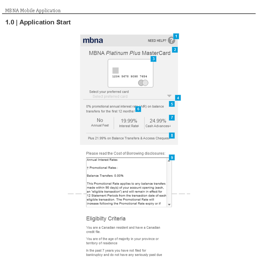
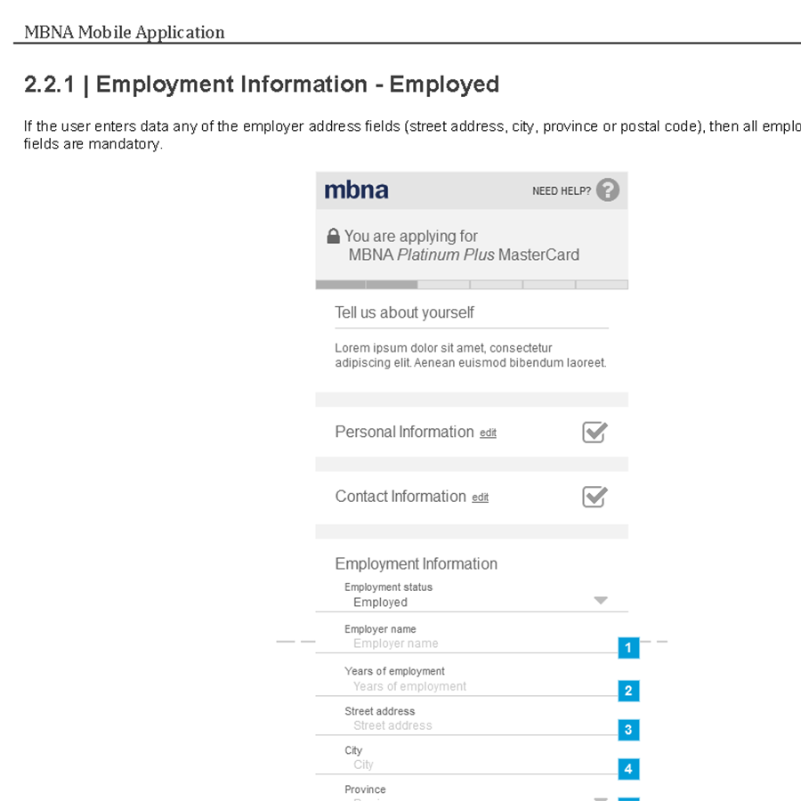
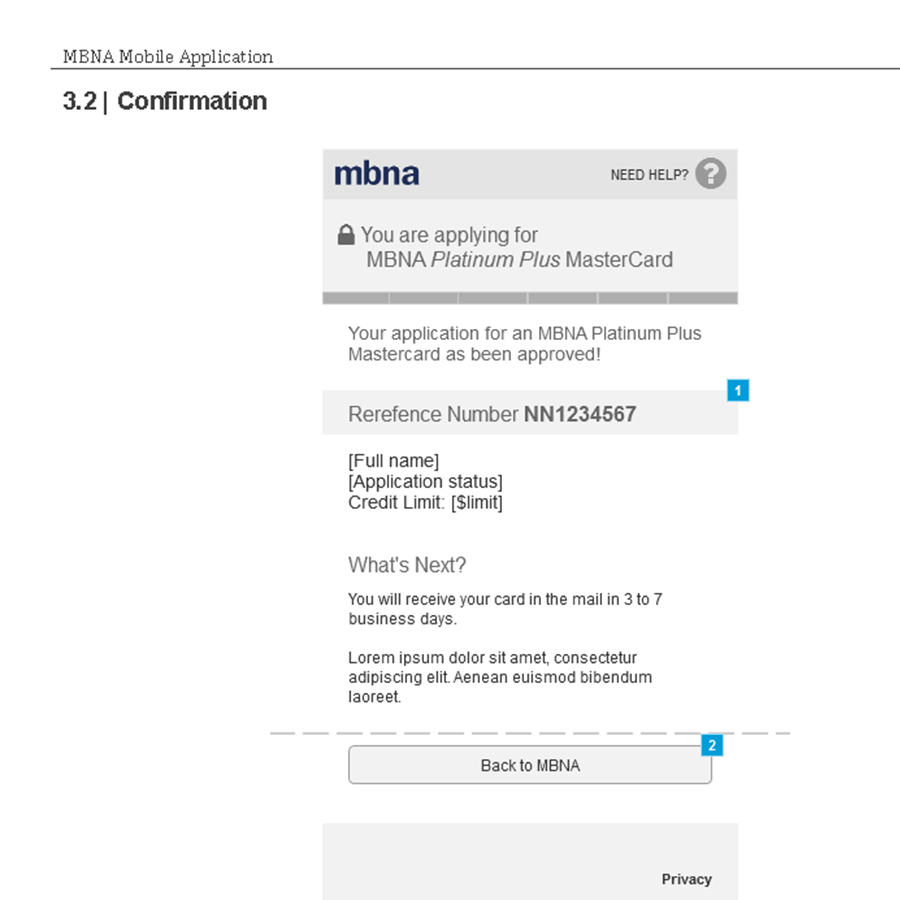
The original desktop credit card application form is one big long single page experience. Certainly not ideal for small screens. I carefully reviewed and documented all of the necessary fields and all of the variations required for an online credit card application. Based on my research, I decided on four steps with a fifth step for application review & submission. Form fields were re-grouped into smaller steps, giving the user better context of why the information is required.
Handling Long Legal
Understanding legal requirements (especially for banks) is really important in order to make smart UX decisions to help meet both the user's needs and the leqal requirements. The legal department insisted that the very long borrowing disclosures (a legal requirement mandated by the Canadian government) had to be inline. This is so the user 'sees' the disclosure before starting the application. But we all know that most users ignore long disclosures and just find where the checkbox is. I proposed a full screen disclosure as an in-between step: the user clicks start, they see the disclosure, they choose whether or not to proceed. I argued this better met the legal need - the user MUST see the disclosure to move on - and made for a better experience for the user - no scroll pane in a scrolling page while also prioritizing the importance of the disclosure. Legal didn't disagree, but I lost the fight due to them feeling it was too much risk to try something new.
The Prototype
The wireframes for this project were done with Axure. The visual designer used the wireframes to complete the visual design. The internal client wanted a high-resolution prototype of the new experience to present to the larger teams at TD. Given my background, I was able to create a pixel perfect prototype using AngularJS (yes, v1). I used SQLite for local storage between steps. The prototype ran locally but felt very much like a live experience. The engineering team ended up building the application form in Angular and appreciated the HTML. CSS and Angular work already done for them.